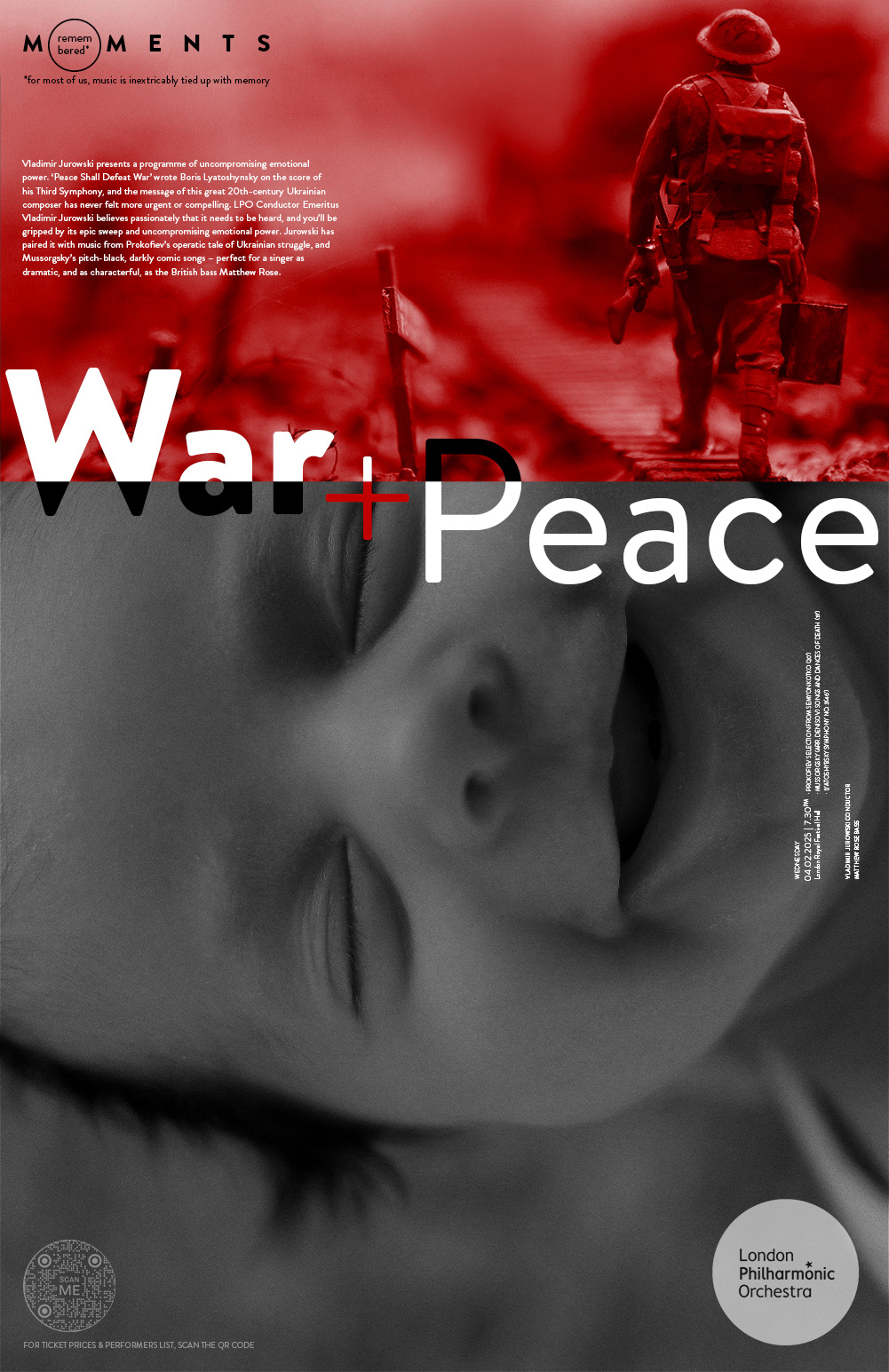
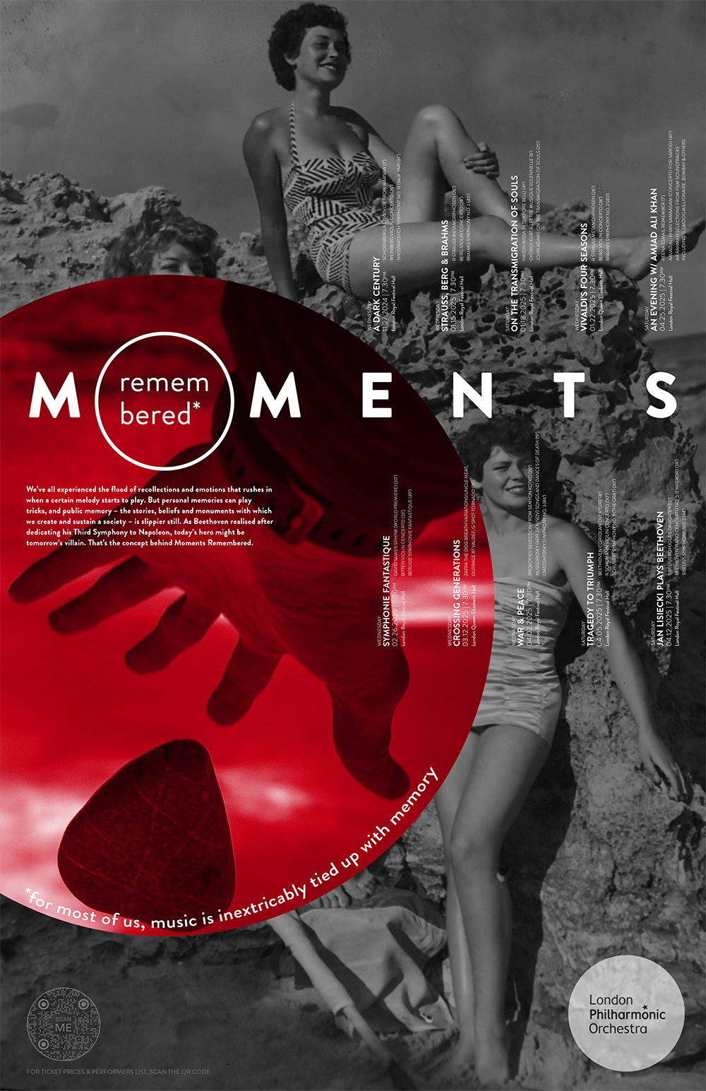
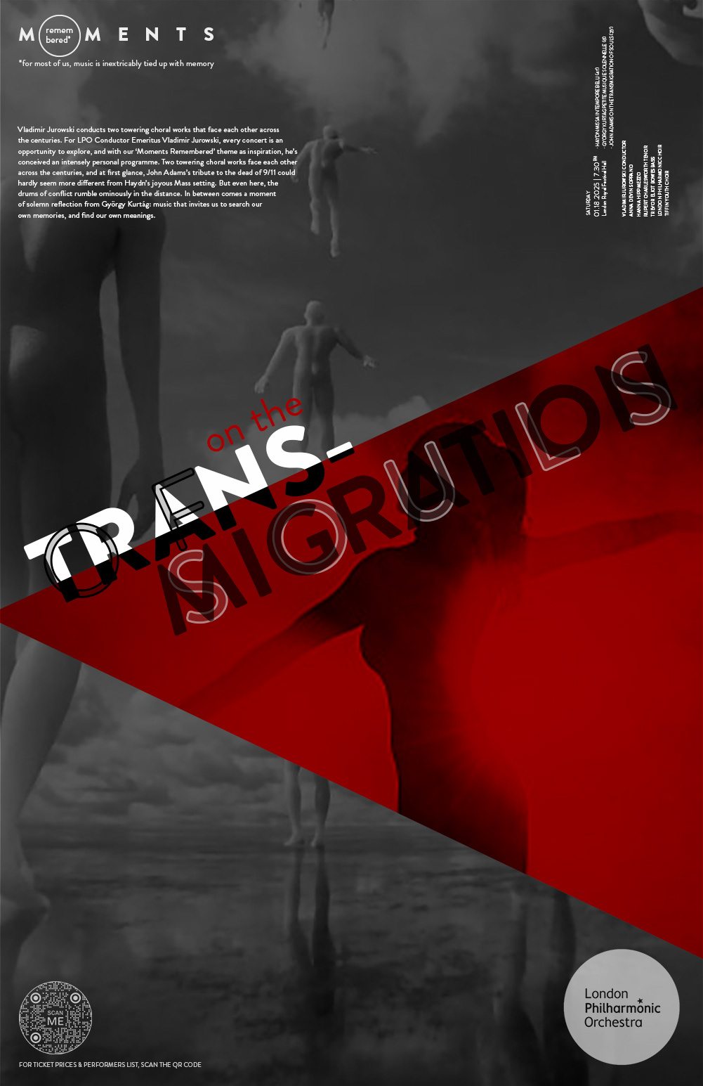
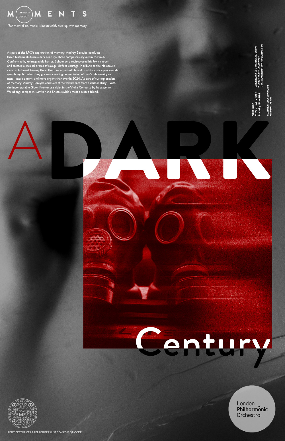
This poster series was created for different London Philharmonic Orchestra concerts, each with its own theme, mood, and emotional tone. To make the series feel connected while still allowing each poster to stand on its own, I built a consistent visual system using a limited red, black, white, and grayscale palette, bold typography, and simple geometric shapes. The result is a cohesive campaign that uses contrast, scale, and layered imagery to express the intensity of each performance while keeping the full series visually unified.
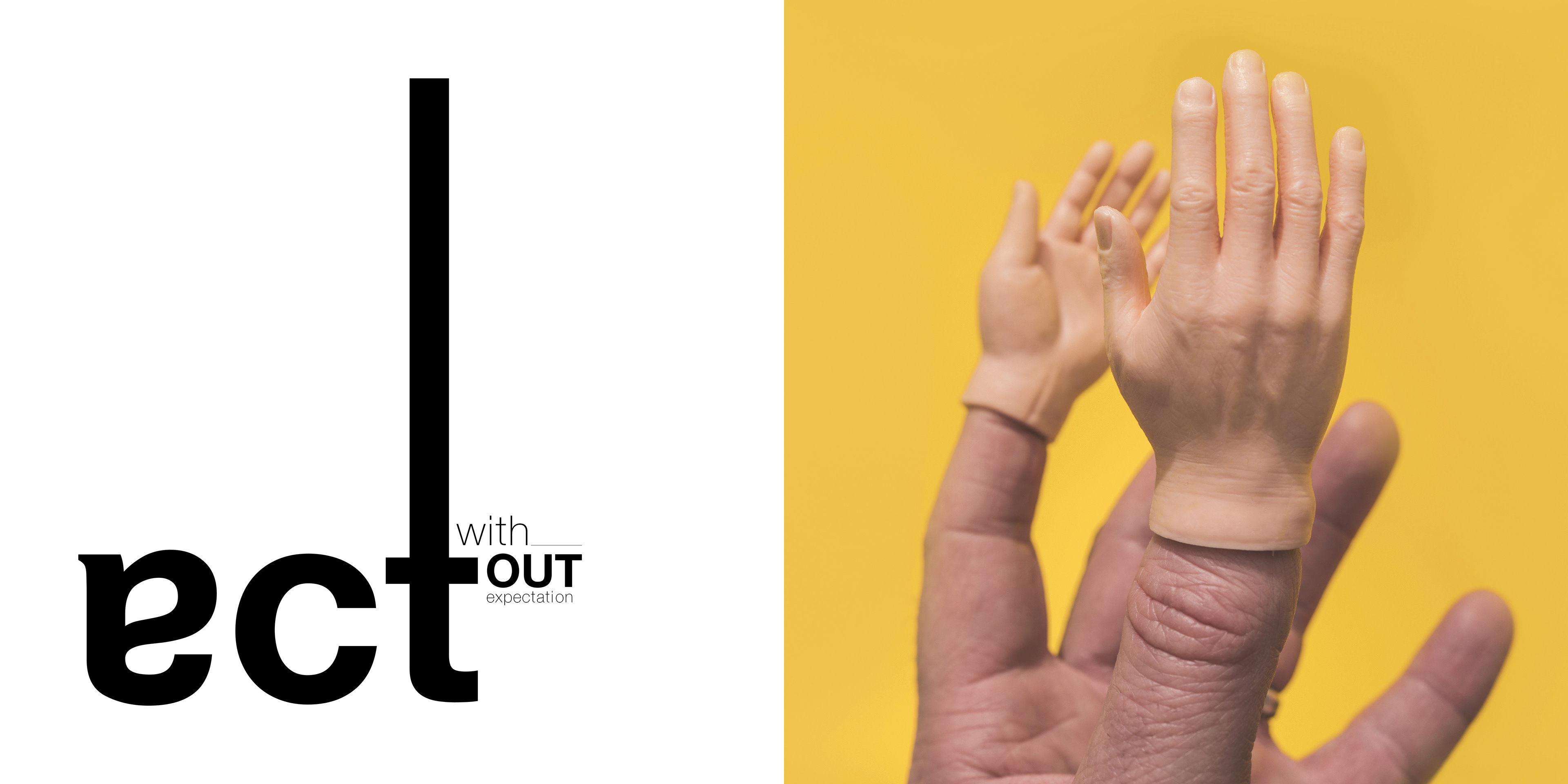

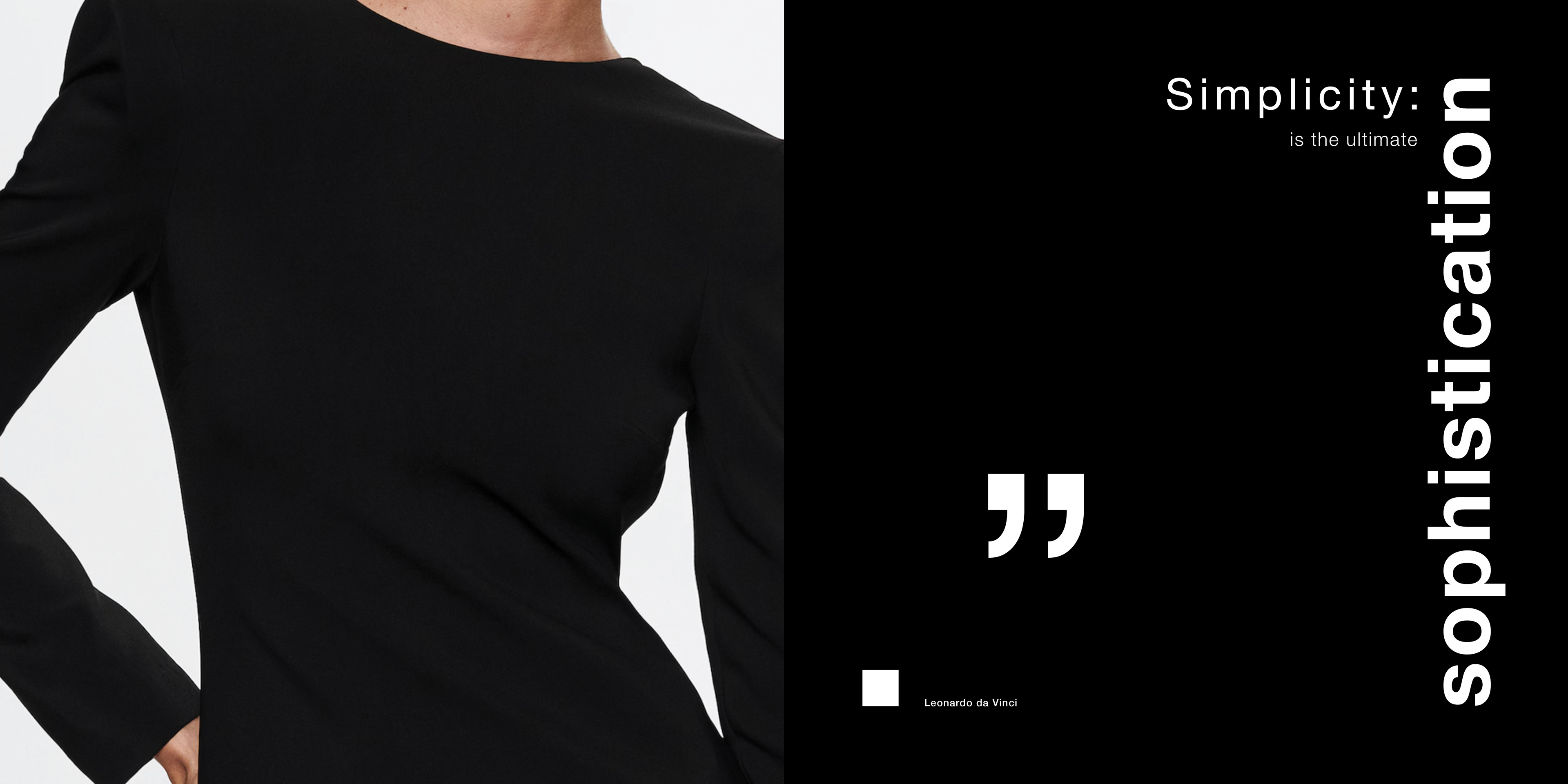


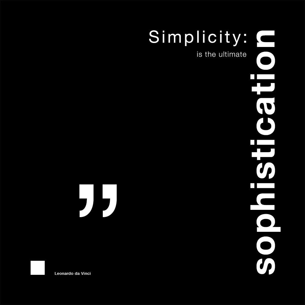
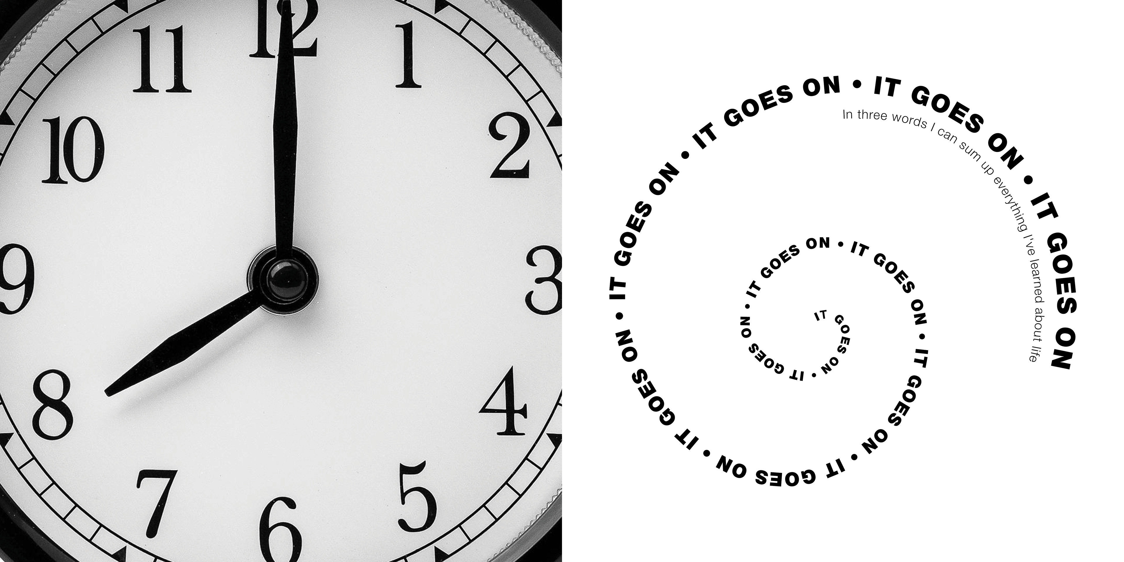
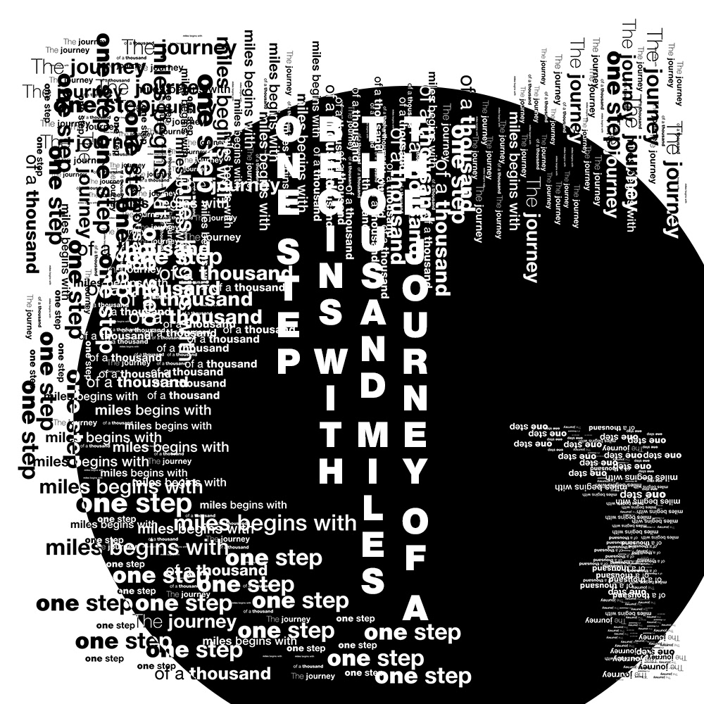
This project explored how typography can carry meaning before imagery is even introduced. Each composition began with the quote itself, using scale, weight, spacing, rotation, and placement to express the message visually. Once the typographic structure was working, I selected images that reinforced the idea and added another layer of interpretation, allowing the text and image to work together as one clear visual statement.
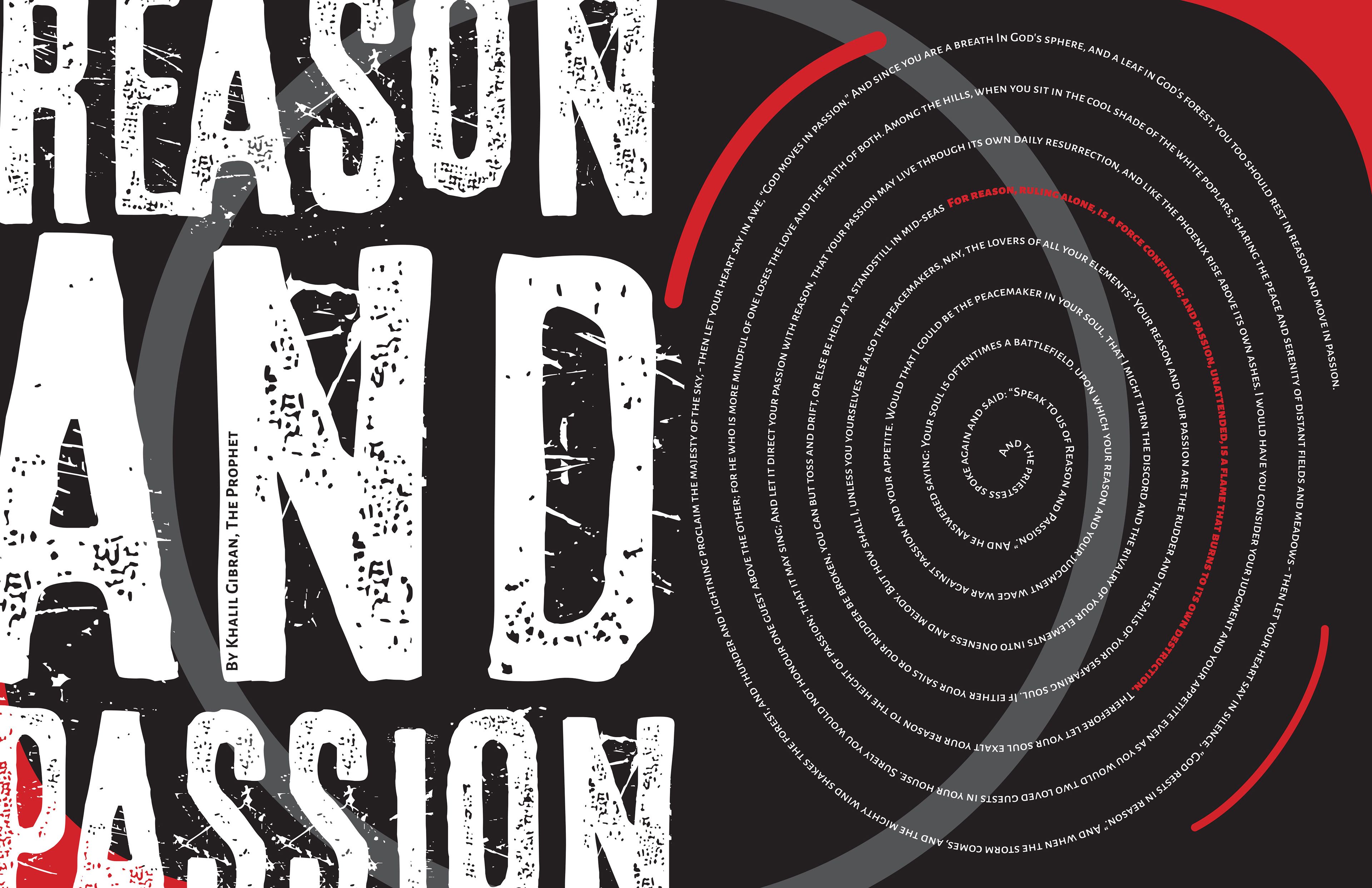
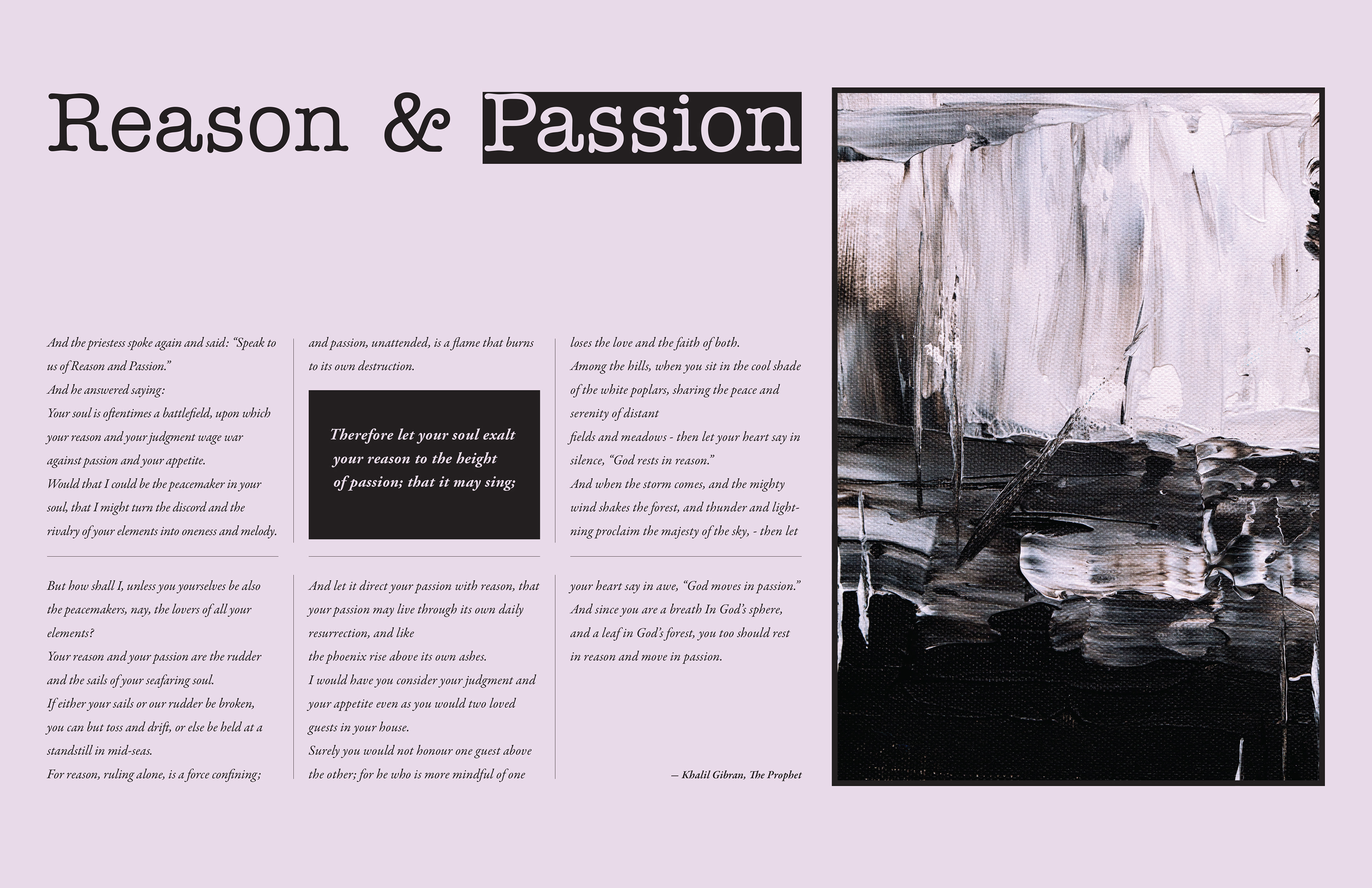
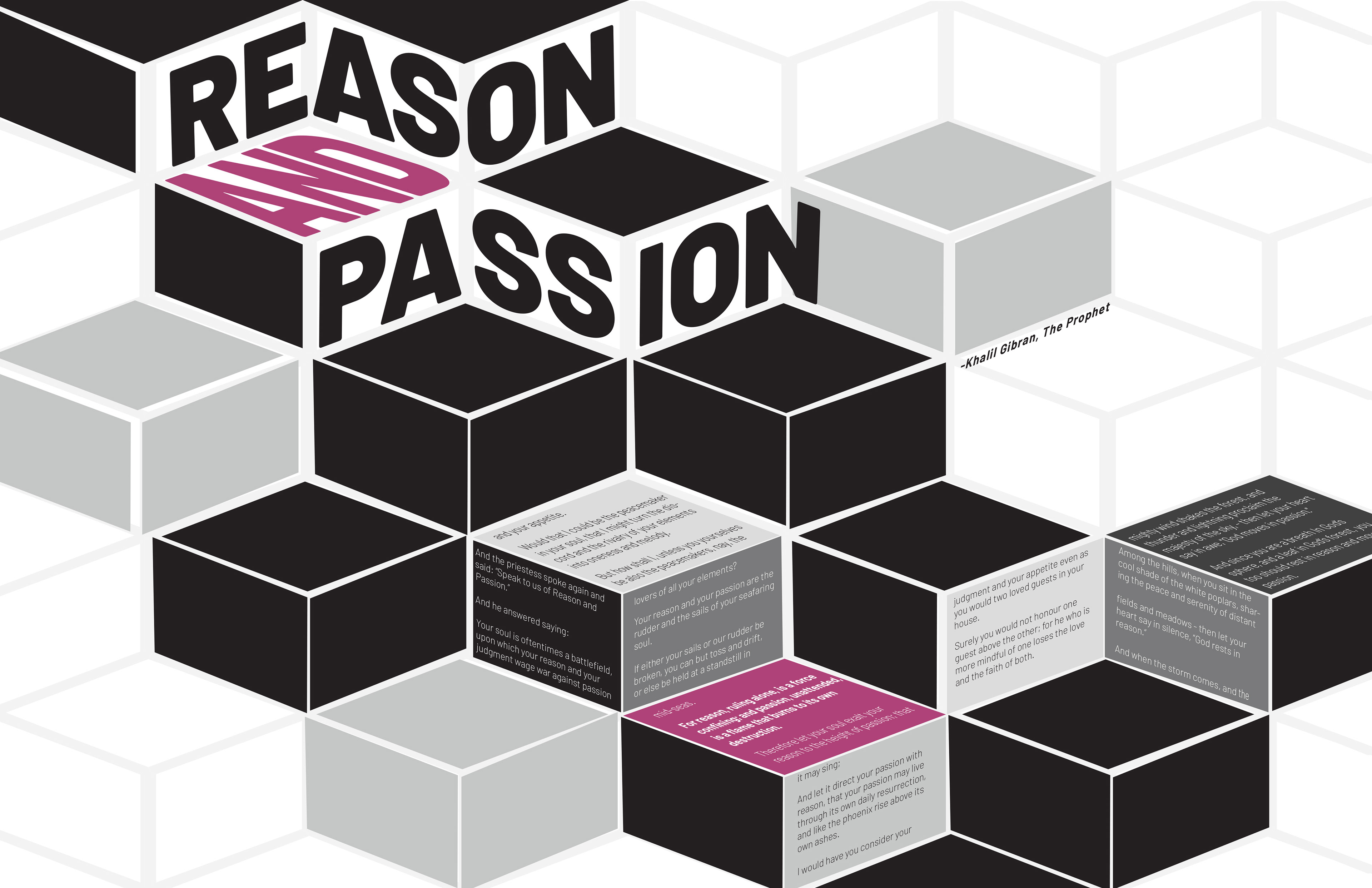
This poster exercise explores how color, layout, and typography can visually express the tension between reason and passion. Black, white, and gray create a sense of structure and control, while the use of pink or red introduces emotion, energy, and disruption. Through bold scale shifts, angled text, circular movement, and grid-based compositions, the layouts translate the words into visual form, showing reason as organized and grounded, and passion as dynamic, expressive, and harder to contain.
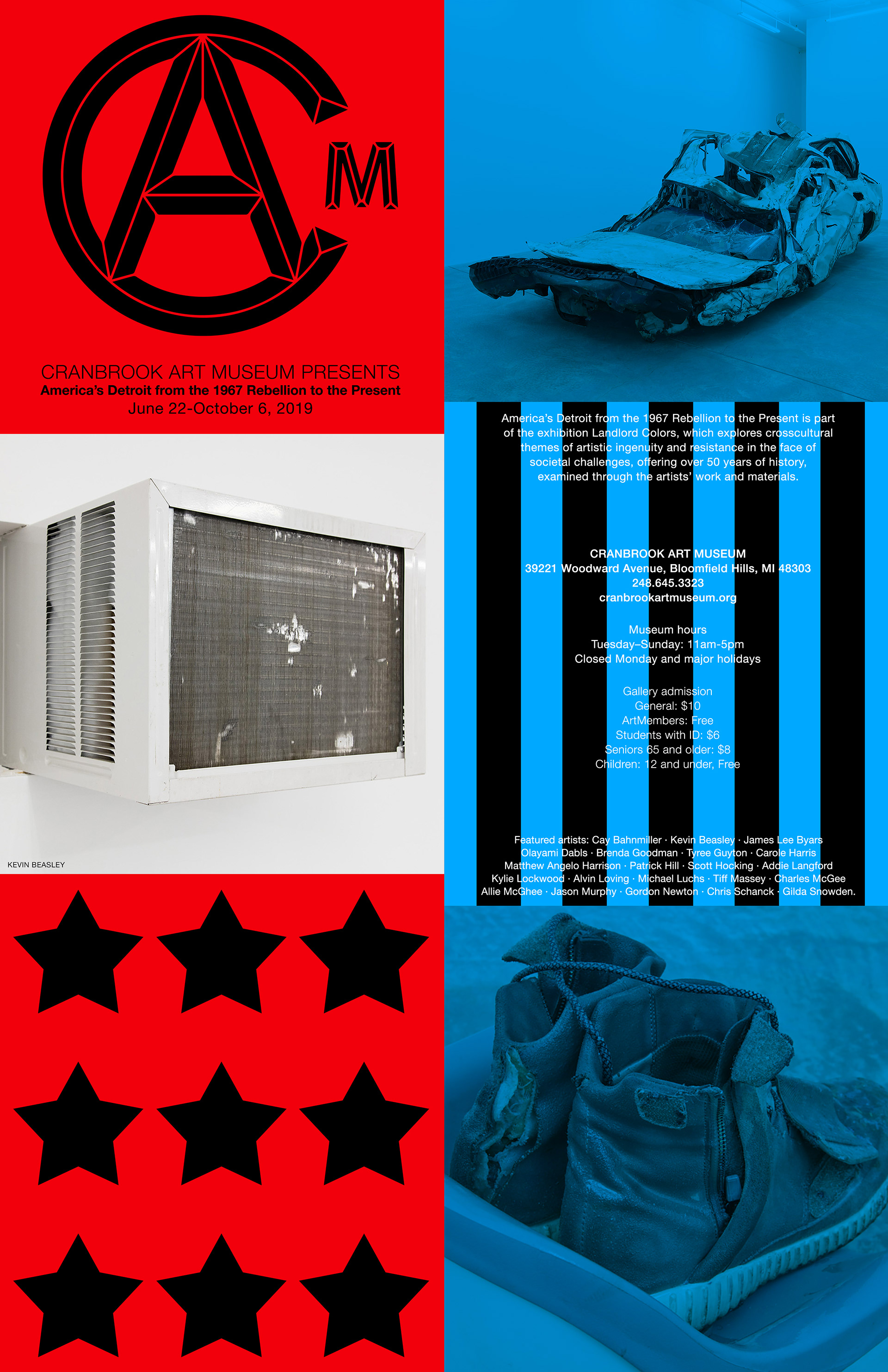
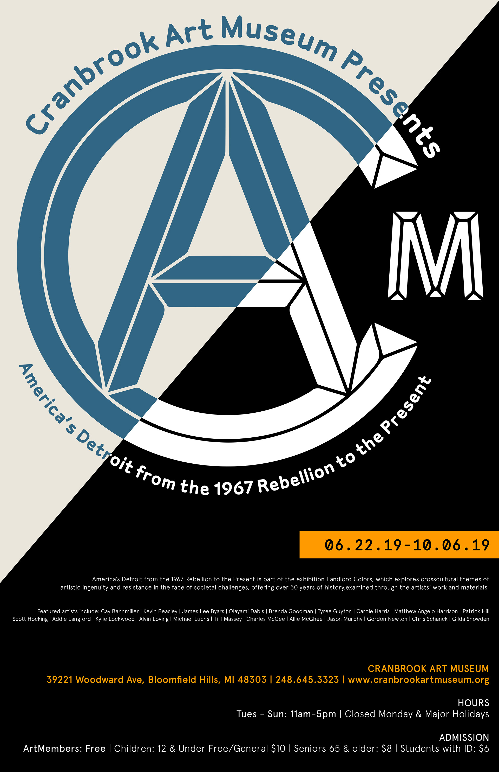
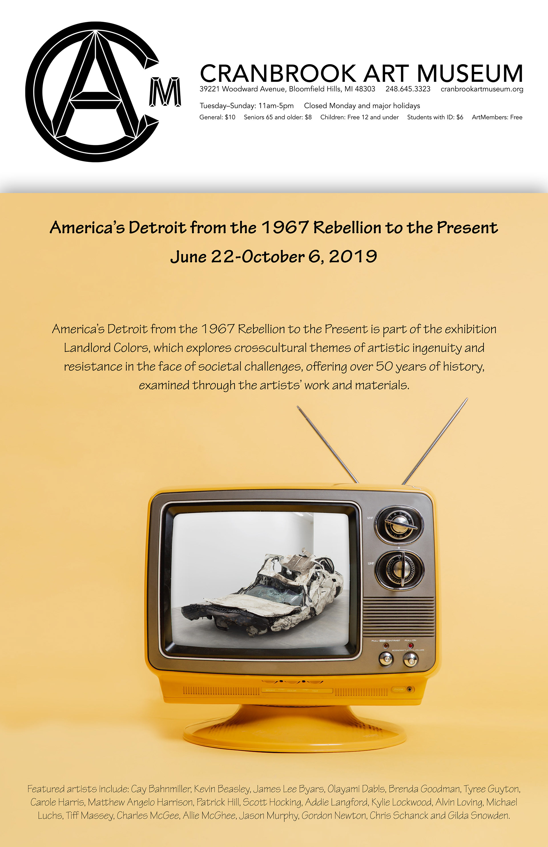
This poster series was created for a Cranbrook Art Museum exhibition about Detroit’s history from the 1967 Rebellion to the present. Each poster takes a different visual approach, while the red, white, and blue palette connects the work to Detroit’s place in America and the larger national conversation around history, resistance, and identity. I used images of the artwork to reflect the exhibition’s themes. At the same time, the old television set suggests looking back in time and viewing the past through memory, media, and cultural record. Bold typography and graphic layouts give the series a strong museum presence while keeping the subject matter urgent and contemporary.
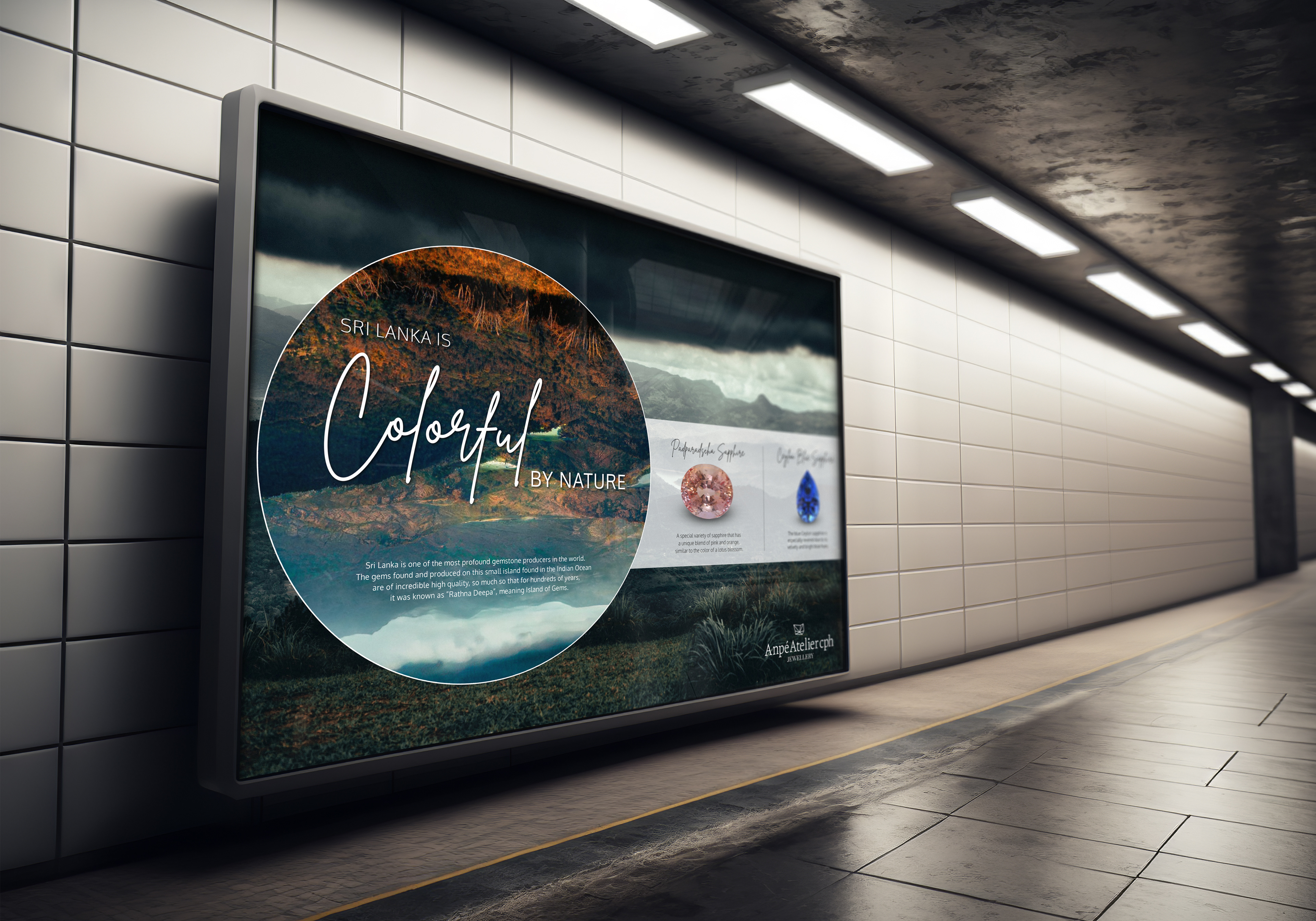
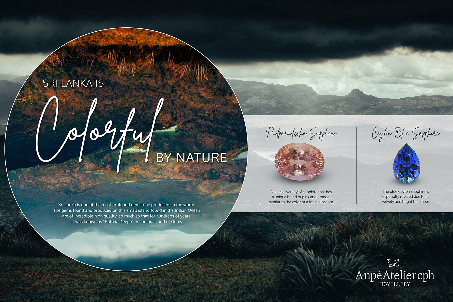
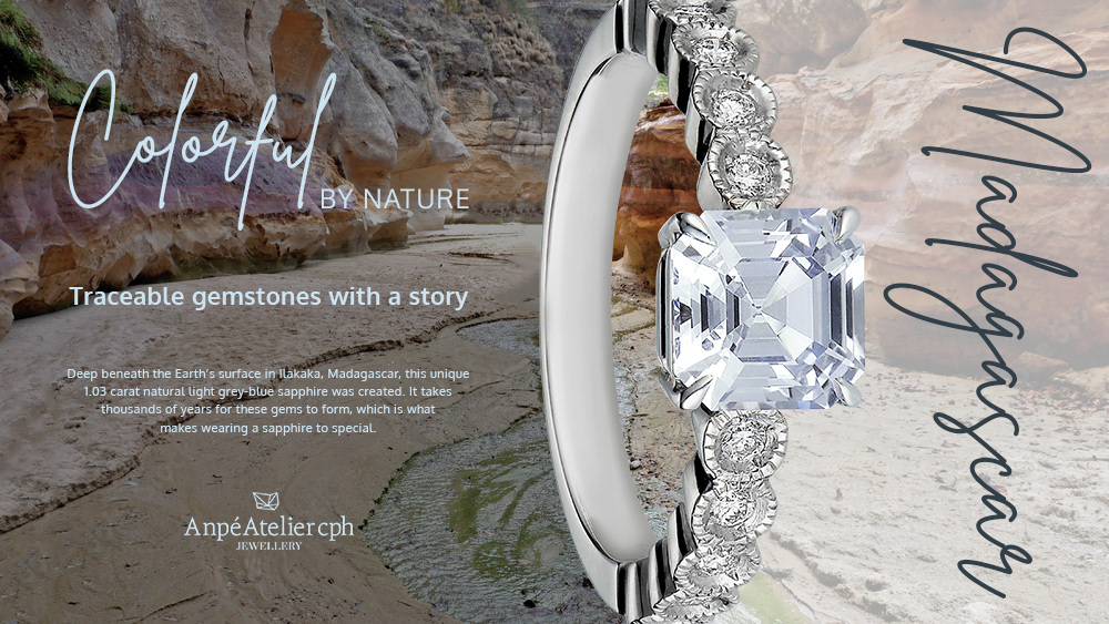
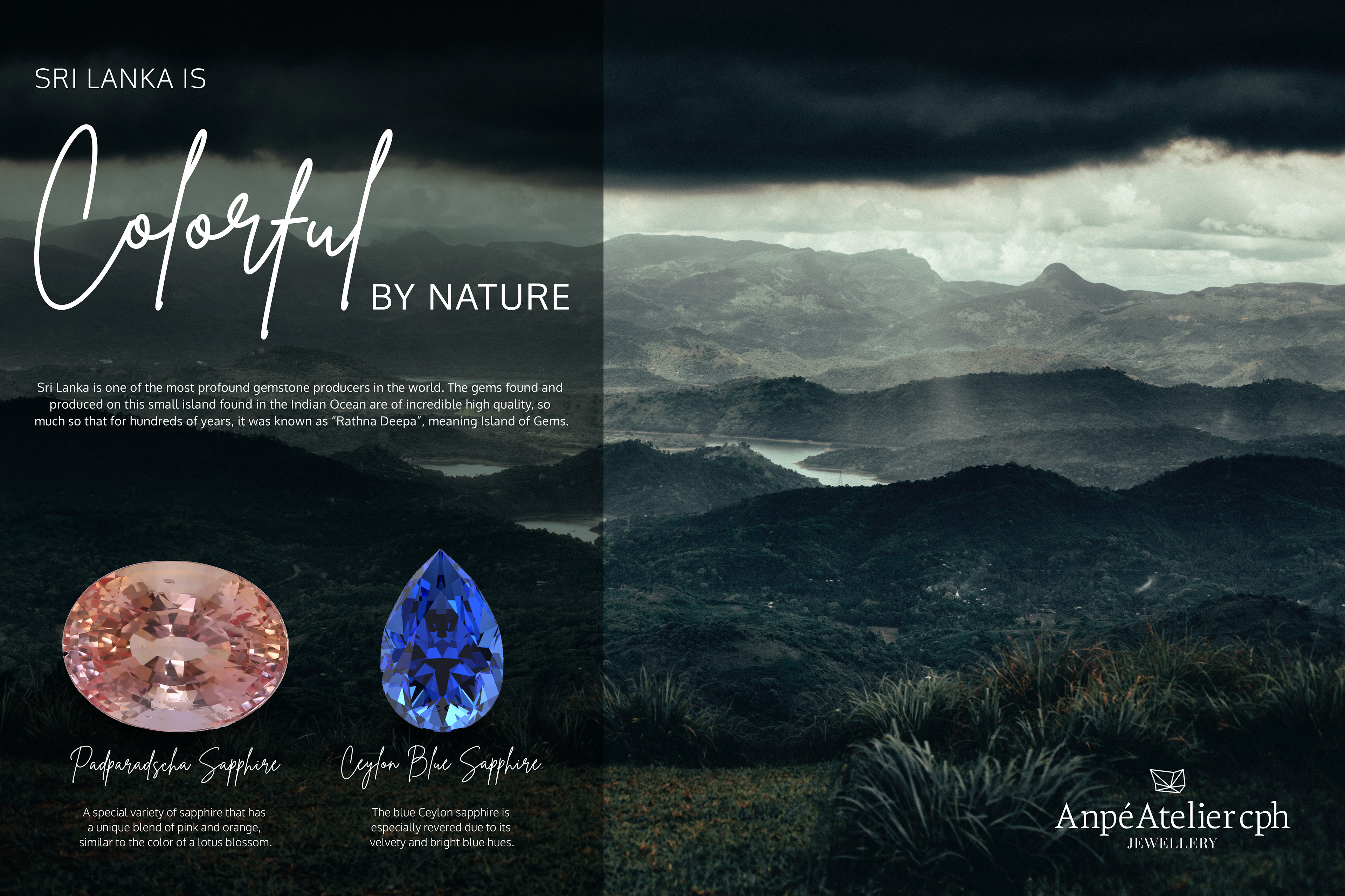
This poster series was created for a Danish jewelry company that responsibly sources its gemstones from Sri Lanka. The campaign connects the elegance of the finished jewelry with the natural landscapes where the gems originate, using atmospheric photography, refined typography, and rich gemstone colors to tell a story of place, rarity, and craftsmanship. The visual direction emphasizes that each stone is not only beautiful but traceable, responsibly sourced, and connected to the earth, making the jewelry feel both luxurious and meaningful.